


CT Mirror gets it right — then wrong — with our Sheff data visualizations
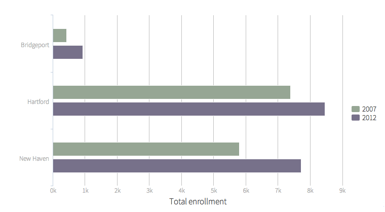
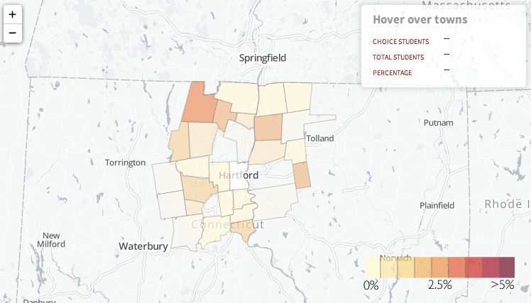
Students in the Cities Suburbs & Schools seminar at Trinity College and I had the privilege of designing online data visualizations with CT Mirror journalists Jacqueline Rabe Thomas and Alvin Chang, which they recently published in their January 15, 2014 story, “By the numbers: Integrating schools in CT.” Last fall, Jacqueline visited our seminar and posed several policy questions on the implementation of the Sheff v. O’Neill voluntary school integration remedy in Hartford, with comparisons to related efforts in New Haven and Bridgeport. We pooled together our public data sets, my students researched and answered the questions in the form of interactive charts and maps, which Alvin polished for publication. Their accompanying story examined different approaches to meeting court-mandated integration goals. For example, in the Hartford region over the past five years, interdistrict magnet school enrollment has increased by over 1,000 students, while the number of Open Choice seats offered by suburban districts to city students has risen by only 531 students. Below are two visualizations co-created by my students to help readers explore and understand these findings.

My students learned valuable lessons by becoming active contributors to the policy discussion through our partnership with CT Mirror. But one of those lessons is to speak up when someone misinterprets your data. In their January 19th weekend wrap-up, CT Mirror’s editors encouraged viewers to visit my students’ data visualizations, but mangled their meaning. They mistakenly wrote that, “The analytical graphics presented in our stories show that the public policies adopted to address school segregation have had only marginal effect on the racial make-up of Connecticut’s inner-city schools – and by some analyses may have actually made things worse.”
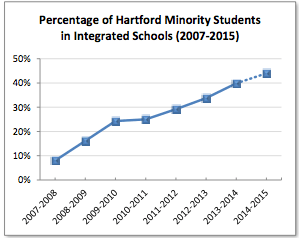
Sorry, but the phrase “marginal effect” puts too negative a spin on our data, and “made things worse” confuses the facts in our story with opinions expressed by other people in the Mirror’s related story the following day. Overall, the Sheff integration remedy has made considerable progress in recent years. The percentage of Hartford-resident minority students who are actually enrolled in reduced-isolation schools increased from about 9 percent in 2006-07 to about 39 percent at present, based on data in our 2007 Trinity report and a careful reading of CSDE figures in this CT Mirror November 26th report). To grasp the scope of this change, look at the Sheff Movement’s own data visualization of integration program growth on their website.
At the same time, let’s be clear that about 60 percent of Hartford’s minority students still attend racially segregated schools, and many citizens continue to debate the goals, methods, and unintended consequences of this voluntary integration remedy. At Trinity, another research team and I are currently asking “Who Chooses?” and investigating school integration lottery application data to determine if participation is skewed by family, school, and neighborhood demographics. While these and other important policy questions remain unanswered, the Mirror’s prior reporting and our Trinity data agree that clear signs of numerical progress in Sheff cannot be discounted. How we visually present and write about data matters just as much as the accuracy of the numbers themselves. My students and I look forward to working with the Mirror’s journalists again and getting it right in future collaborations.
– See more at: http://commons.trincoll.edu/jackdougherty/2014/01/20/ct-mirror/#sthash.RFsnhhXz.dpuf
CT Mirror gets it right — then wrong — with our Sheff data visualizations
Students in the Cities Suburbs & Schools seminar at Trinity College and I had the privilege of designing online data visualizations with CT Mirror journalists Jacqueline Rabe Thomas and Alvin Chang, which they recently published in their January 15, 2014 story, “By the numbers: Integrating schools in CT.” Last fall, Jacqueline visited our seminar and posed several policy questions on the implementation of the Sheff v. O’Neill voluntary school integration remedy in Hartford, with comparisons to related efforts in New Haven and Bridgeport. We pooled together our public data sets, my students researched and answered the questions in the form of interactive charts and maps, which Alvin polished for publication. Their accompanying story examined different approaches to meeting court-mandated integration goals. For example, in the Hartford region over the past five years, interdistrict magnet school enrollment has increased by over 1,000 students, while the number of Open Choice seats offered by suburban districts to city students has risen by only 531 students. Below are two visualizations co-created by my students to help readers explore and understand these findings:
My students learned valuable lessons by becoming active contributors to the policy discussion through our partnership with CT Mirror. But one of those lessons is to speak up when someone misinterprets your data. In their January 19th weekend wrap-up, CT Mirror’s editors encouraged viewers to visit my students’ data visualizations, but mangled their meaning. They mistakenly wrote that, “The analytical graphics presented in our stories show that the public policies adopted to address school segregation have had only marginal effect on the racial make-up of Connecticut’s inner-city schools – and by some analyses may have actually made things worse.”
Sorry, but the phrase “marginal effect” puts too negative a spin on our data, and “made things worse” confuses the facts in our story with opinions expressed by other people in the Mirror’s related story the following day. Overall, the Sheff integration remedy has made considerable progress in recent years. The percentage of Hartford-resident minority students who are actually enrolled in reduced-isolation schools increased from about 9 percent in 2006-07 to about 39 percent at present, based on data in our 2007 Trinity report and a careful reading of CSDE figures in this CT Mirror November 26th report). To grasp the scope of this change, look at the Sheff Movement’s own data visualization of integration program growth on their website.
Click to view chart on Sheff Movement site
At the same time, let’s be clear that about 60 percent of Hartford’s minority students still attend racially segregated schools, and many citizens continue to debate the goals, methods, and unintended consequences of this voluntary integration remedy. At Trinity, another research team and I are currently asking “Who Chooses?” and investigating school integration lottery application data to determine if participation is skewed by family, school, and neighborhood demographics. While these and other important policy questions remain unanswered, the Mirror’s prior reporting and our Trinity data agree that clear signs of numerical progress in Sheff cannot be discounted. How we visually present and write about data matters just as much as the accuracy of the numbers themselves. My students and I look forward to working with the Mirror’s journalists again and getting it right in future collaborations.
– See more at: http://commons.trincoll.edu/jackdougherty/2014/01/20/ct-mirror/#sthash.RFsnhhXz.dpuf
Students in the Cities, Suburbs & Schools seminar at Trinity College and I had the privilege of designing online data visualizations with CT Mirror journalists Jacqueline Rabe Thomas and Alvin Chang, which they recently published in their January 15, 2014 story, “By the numbers: Integrating schools in CT.”
Last fall, Jacqueline visited our seminar and posed several policy questions on the implementation of the Sheff v. O’Neill voluntary school integration remedy in Hartford, with comparisons to related efforts in New Haven and Bridgeport. We pooled together our public data sets, my students researched and answered the questions in the form of interactive charts and maps, which Alvin polished for publication. Their accompanying story examined different approaches to meeting court-mandated integration goals. For example, in the Hartford region over the past five years, interdistrict magnet school enrollment has increased by over 1,000 students, while the number of Open Choice seats offered by suburban districts to city students has risen by only 531 students. The Mirror story shows two visualizations co-created by my students to help readers explore and understand these findings:
My students learned valuable lessons by becoming active contributors to the policy discussion through our partnership with CT Mirror. But one of those lessons is to speak up when someone misinterprets your data. In their January 19th weekend wrap-up, CT Mirror’s editors encouraged viewers to visit my students’ data visualizations, but mangled their meaning. They mistakenly wrote that, “The analytical graphics presented in our stories show that the public policies adopted to address school segregation have had only marginal effect on the racial make-up of Connecticut’s inner-city schools – and by some analyses may have actually made things worse.”
Sorry, but the phrase “marginal effect” puts too negative a spin on our data, and “made things worse” confuses the facts in our story with opinions expressed by other people in the Mirror’s related story the following day. Overall, the Sheff integration remedy has made considerable progress in recent years. The percentage of Hartford-resident minority students who are actually enrolled in reduced-isolation schools increased from about 9 percent in 2006-07 to about 39 percent at present, based on data in our 2007 Trinity report and a careful reading of CSDE figures in this CT Mirror November 26th report). To grasp the scope of this change, look at the Sheff Movement’s own data visualization of integration program growth on their website.
Click to view chart on Sheff Movement site
At the same time, let’s be clear that about 60 percent of Hartford’s minority students still attend racially segregated schools, and many citizens continue to debate the goals, methods, and unintended consequences of this voluntary integration remedy.
At Trinity, another research team and I are currently asking “Who Chooses?” and investigating school integration lottery application data to determine if participation is skewed by family, school, and neighborhood demographics. While these and other important policy questions remain unanswered, the Mirror’s prior reporting and our Trinity data agree that clear signs of numerical progress in Sheff cannot be discounted. How we visually present and write about data matters just as much as the accuracy of the numbers themselves. My students and I look forward to working with the Mirror’s journalists again and getting it right in future collaborations.